The Rate Distances Report helps you analyze your trip pricing by calculating the actual mileage for each trip and showing you the effective rate per mile. It’s designed for operators who currently use flat rate or zone-based pricing and want to evaluate whether switching to mileage-based rates could be more profitable — or for anyone who wants to understand how their pricing compares on a per-mile basis.
How to Access the Report
- Navigate to Reports > Rate Distances in the left sidebar

Generating the Report
Fill in the filters at the top of the page:
- Start Date — Beginning of the date range
- End Date — End of the date range
- Region — Optional. Select “NY/NJ Only” to filter to trips with a pickup or dropoff in New York or New Jersey, or leave as “All Regions”
- Billing Account(s) — Optional. Search and select one or more billing accounts to filter the report to specific customers. Start typing to search — accounts load dynamically
- Flat Rate Only — Check this box to only include trips that have a “Flat Rate” charge. Unchecked, the report includes all base rate charges
- Farmout Only — Check this box to only include trips that were farmed out to an affiliate
- Click Generate Report
A loading spinner will appear while the report processes, as it calculates distances for each trip.

Understanding the Summary Statistics
At the very top of the results, four summary numbers give you a quick overview:
- Total Trips — Number of trips in the results
- Total Miles — Combined mileage across all trips
- Total Revenue — Combined base rate revenue
- Average Rate/Mile — Your overall effective rate per mile (total revenue divided by total miles)

Breakout Tables
Below the summary, the report breaks down your data in several ways:
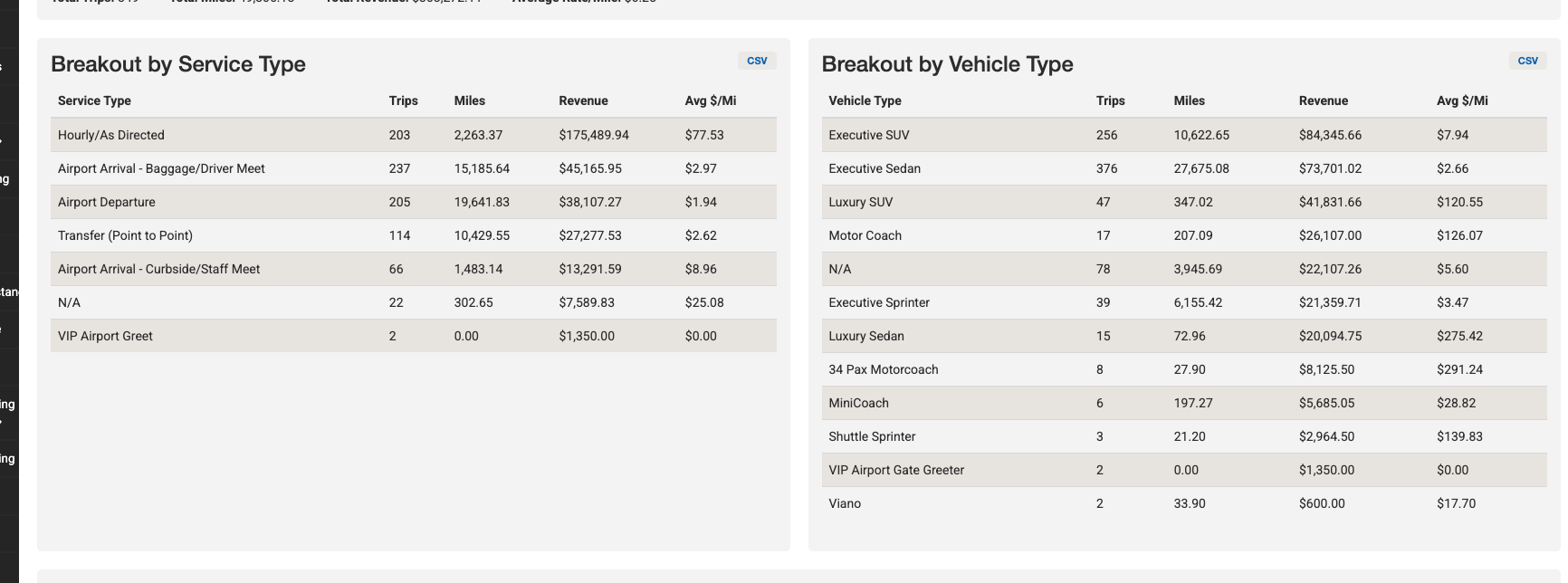
Breakout by Service Type
Shows trip count, total miles, total revenue, and average rate per mile grouped by service type (e.g., Point to Point, Airport Transfer, Hourly). Each table has its own CSV export button.
Breakout by Vehicle Type
Same breakdown grouped by vehicle category (e.g., Sedan, SUV, Sprinter).
Breakout by Customer
Shows the same metrics grouped by billing account or customer name, displayed in two side-by-side columns sorted by revenue (highest first). Has its own CSV export button.
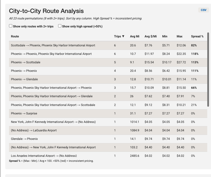
City-to-City Route Analysis
This table shows every unique route (by pickup city to dropoff city) with:
| Column | What It Means |
|---|---|
| Route | The city-to-city pair (e.g., “Manhattan → Newark”) |
| Trips | Number of trips on this route |
| Avg Mi | Average distance for trips on this route |
| Avg $/Mi | Average rate per mile for this route |
| Min | Lowest rate per mile seen on this route |
| Max | Highest rate per mile seen on this route |
| Spread % | How inconsistent your pricing is — calculated as (Max – Min) / Avg x 100. Values over 50% appear in red |
You can filter this table using the checkboxes above it:
- Show only routes with 2+ trips — Hides one-off routes to focus on recurring patterns
- Show only high spread (>50%) — Highlights routes where your pricing is most inconsistent
Click any column header to sort. This table also has a CSV export button.
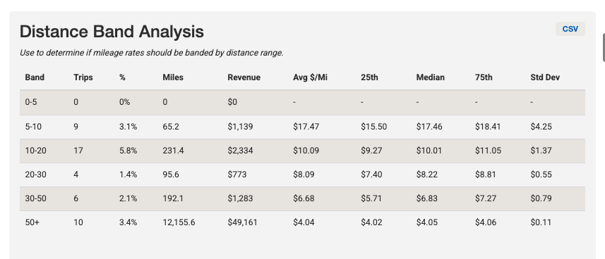
Distance Band Analysis
Groups trips into mileage bands (0–5, 5–10, 10–20, 20–30, 30–50, and 50+ miles) and shows:
| Column | What It Means |
|---|---|
| Band | The distance range |
| Trips | Number of trips in this range |
| % | Percentage of total trips |
| Miles | Total miles in this band |
| Revenue | Total revenue from trips in this band |
| Avg $/Mi | Average rate per mile |
| 25th / Median / 75th | Percentile breakdowns of the rate per mile |
| Std Dev | How much the rate varies within the band |
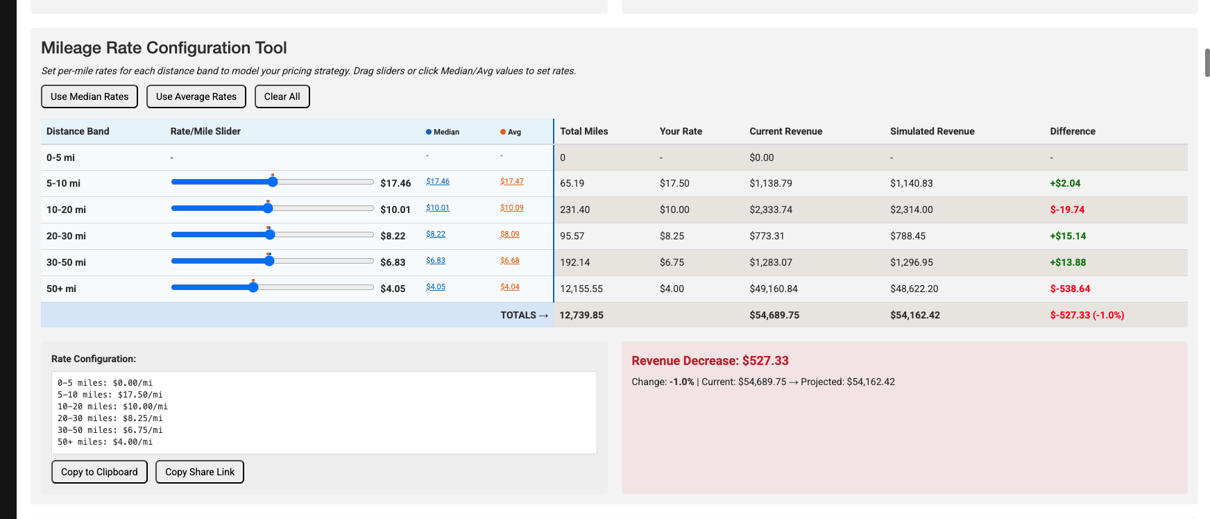
Mileage Rate Configuration Tool
This interactive tool lets you model what your revenue would look like under different per-mile rate structures:
- Set rates using sliders — Each distance band has a slider to set your desired rate per mile. Blue and orange dots on each slider show the median and average rates for reference
- Quick-fill buttons:
- Use Median Rates — Sets all sliders to the median rate for each band
- Use Average Rates — Sets all sliders to the average rate for each band
- Clear All — Resets all sliders to zero
- Click the Median or Avg values next to each slider to instantly set that band to that rate
The tool shows in real time:
- Your Rate — The per-mile rate you’ve set
- Current Revenue — What you actually earned with your current pricing
- Simulated Revenue — What you would earn at the new per-mile rate
- Difference — The revenue impact (green for increase, red for decrease)
- Impact Summary — A prominent box showing the total revenue change in dollars and percentage
Sharing Your Rate Configuration
- Copy to Clipboard — Copies a text summary of your rate configuration
- Copy Share Link — Generates a URL that includes your rate settings, so you can share the exact configuration with a colleague
Banding Recommendation Insights
Below the configuration tool, the report provides guidance on interpreting the data:
- If shorter trips have significantly higher average rates than longer trips, consider tiered pricing
- If rates are consistent across bands, a single flat rate per mile may be sufficient
- A large min/max spread within a band suggests inconsistent pricing that could be standardized
- The median is often more representative than the average when outliers exist
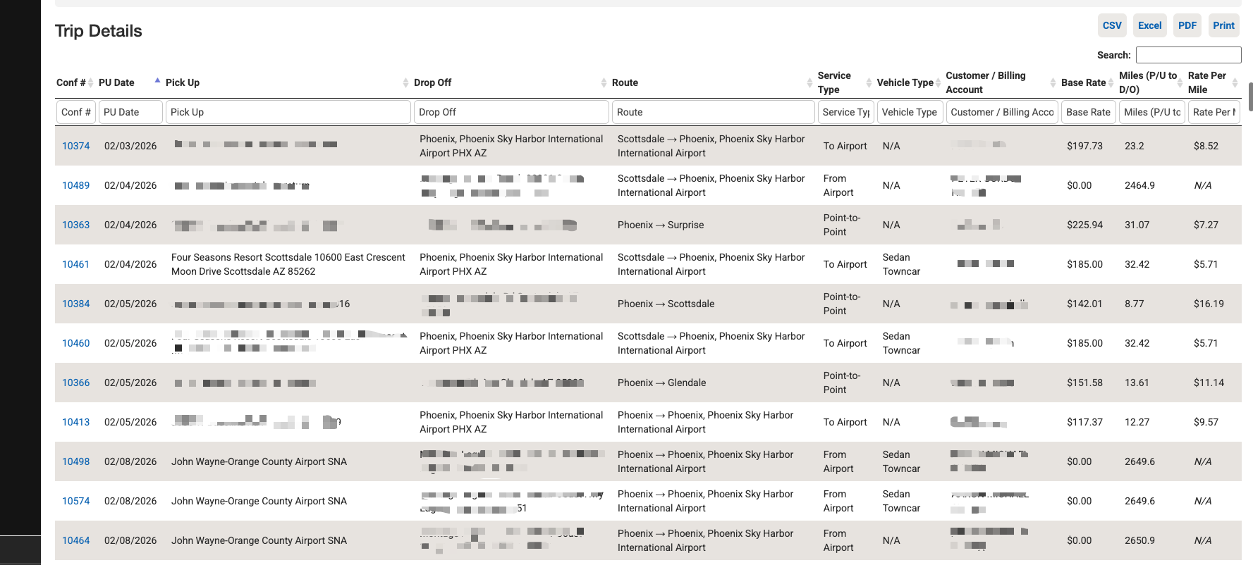
Trip Details Table
At the bottom of the report, a searchable and sortable table lists every individual trip with:
| Column | What It Means |
|---|---|
| Conf # | Confirmation number (click to open the trip) |
| PU Date | Pickup date |
| Affiliate | The affiliate name (only shown when “Farmout Only” is checked) |
| Pick Up | Full pickup address |
| Drop Off | Full dropoff address |
| Route | City-to-city route |
| Service Type | The type of service |
| Vehicle Type | The vehicle category |
| Customer / Billing Account | Who was billed |
| Base Rate | The base rate charged |
| Miles (P/U to D/O) | Calculated distance from pickup to dropoff |
| Rate Per Mile | The effective rate per mile (base rate divided by miles) |
Use the column filters (type in the second header row) to narrow results. Export using the CSV, Excel, PDF, or Print buttons.
Tips and Best Practices
- Start with the Distance Band Analysis. It quickly shows whether shorter trips earn a higher per-mile rate than longer ones — the most common sign that tiered pricing could work.
- Use the Route Analysis to find pricing inconsistencies. Routes with a high Spread % mean you’re charging very different rates for the same route, which may indicate ad-hoc pricing that could be standardized.
- Filter by billing account to analyze key customers. Use the Billing Account filter to run the report for a specific client and see their rate-per-mile profile before contract renewal.
- Check “Flat Rate Only” when evaluating zone pricing. This isolates trips priced with a flat rate charge so you can directly compare what you charged versus what a mileage rate would have earned.
- Use “Farmout Only” to audit affiliate pricing. See how your per-mile costs compare when work is farmed out versus handled in-house.
- Play with the Rate Configuration Tool before making changes. Model different scenarios — try the median rates first to see a conservative estimate, then adjust bands individually.
Troubleshooting
- Miles show “N/A” for some trips — The distance could not be calculated, usually because the pickup or dropoff address is missing or incomplete.
- Base Rate shows $0 — The trip may not have pricing assigned yet, or the charge structure doesn’t include a base rate or flat rate charge (depending on your filter).
- Report takes a long time to load — The report calculates distances for every trip. For large date ranges, expect longer processing times. Try narrowing the date range or filtering by account.
- Rate per mile seems unreasonably high or low — Check the trip details. Very short trips (under 1 mile) will have a very high rate per mile, while trips with incorrect addresses may show inflated mileage.