The Trips by Hour report shows you a heat map of your trip volume broken down by each hour of the day and each day of the week. It helps you quickly identify your busiest and slowest time slots so you can plan staffing, vehicle availability, and driver schedules more effectively.
How to Access the Report
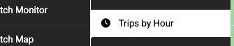
- Navigate to Reports > Trips by Hour in the left sidebar
Setting Up the Report
At the top of the page you’ll find the filters:
- Start Date — The beginning of the date range (defaults to the most recent Sunday)
- End Date — The end of the date range (defaults to the following Saturday)
- Location — Filter by a specific company location, or leave set to “All Locations” to include all trips
- Click Update Range to refresh the report
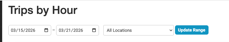
By default, the report shows the current week (Sunday through Saturday). You can change the date range to any period you like — it doesn’t have to be a single week.
Reading the Heat Map
The report displays a grid with:
- Rows — Each hour of the day, from 12:00 AM at the top to 11:00 PM at the bottom
- Columns — Each day of the week (Sunday through Saturday), with the specific date shown above the day name
- Cells — The number of trips scheduled during that hour on that day
Color Coding
Cells are color-coded based on how busy that time slot is relative to your peak hour:
| Color | Meaning | Range |
|---|---|---|
| Very light green | Empty | 0 trips |
| Light green | Low volume | 1–20% of your busiest hour |
| Medium green | Medium volume | 21–40% of your busiest hour |
| Yellow | Moderate volume | 41–60% of your busiest hour |
| Orange | Busy | 61–80% of your busiest hour |
| Red | Very busy | 81–100% of your busiest hour |
A legend with these colors is displayed below the table for quick reference.
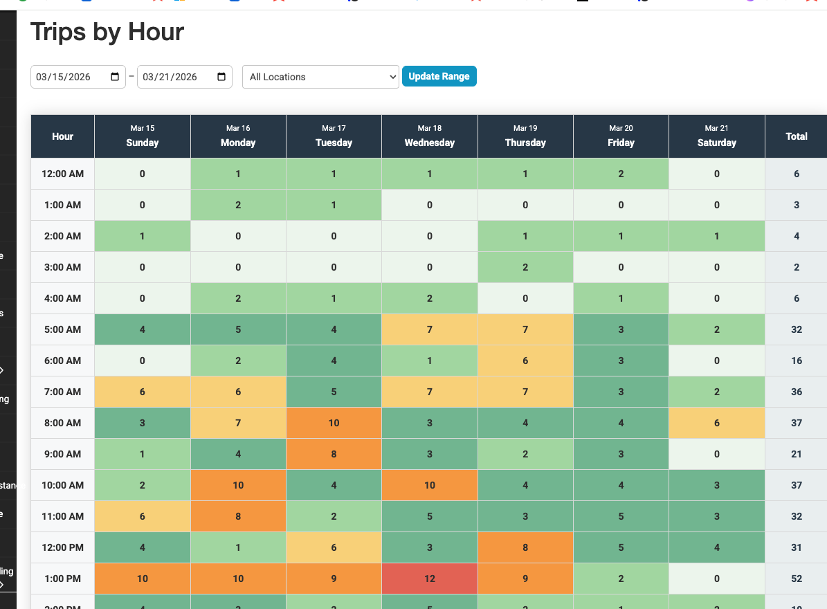
Totals
- Row totals (rightmost column) — The total number of trips for that hour across all days in the range
- Column totals (bottom row) — The total number of trips for that day across all hours
- Grand total (bottom-right corner) — The total number of trips in the entire date range
Filtering by Location
If your company has multiple locations (branches or offices), use the Location dropdown to view trip volume for a specific location only. This is useful for:
- Comparing how busy different branches are at different times
- Planning staffing for a specific office
- Identifying location-specific peak hours
Exporting the Report
Click the Export to CSV button in the top-right area to download the heat map data as a spreadsheet. The CSV file includes:
- All 24 hourly rows with trip counts for each day
- A totals row at the bottom
- The file name includes the location, date range, and export timestamp
Tips and Best Practices
- Use this report for staffing decisions. If you consistently see high volume between 6:00 AM and 9:00 AM on weekdays, make sure you have enough drivers and dispatchers available during those hours.
- Compare week over week. Run the report for different weeks to see if your busy patterns are consistent or seasonal.
- Filter by location to spot differences. One branch may peak in the morning while another is busiest in the evening.
- Look for gaps. Hours with zero or very low trips might be opportunities to reduce operating costs — or to run promotions to fill idle time.
- The colors are relative, not absolute. A red cell means that hour is your busiest compared to other hours in the same report. If your busiest hour has 5 trips, a cell with 5 trips will be red. Run the report for a larger date range if you want a broader perspective.
Troubleshooting
- All cells show 0 — Make sure you have trips within the selected date range. Check that the date range is correct and includes days with scheduled pickups.
- Times seem off by a few hours — The report uses your system timezone setting. Verify your timezone is correct under Settings > System. All pickup times stored in the database are converted to your timezone for display.
- Location dropdown is empty — Your account may not have multiple company locations configured. Contact your administrator to set up locations if needed.